

America's Bad Pedestrian Safety Record
Tracing the Rise in Pedestrian Fatalities

Pedestrians in the US are killed three times as often as their peers in Canada, Italy, or the UK — and it’s getting worse.
With over 7500 pedestrians killed by car drivers each year, Americans face triple the pedestrian fatality risk of other developed countries. Today, American pedestrians are nearly twice as likely to be killed as they were in 2010.
The US’s unique and alarming rise has recently received an increasing level of scrutiny but few solid answers.
I’ve been researching this increase over the past few months, and uncovered some intriguing clues by combining multiple data sources1.
And while there may be a simple change that explains most or all of this increase, I haven’t found it. This post spotlights some of the drivers of increased pedestrian fatalities by focusing on two periods: 2009-2011 (abbreviated in some cases as “2010”) and 2019-2021 (abbreviated in some cases as “2020.”
Pedestrian Fatalities Are Highest In the Sun Belt (and lowest in the North)
Pedestrian fatality rates are highest in Sun Belt states — New Mexico, Florida, South Carolina, Louisiana, and Arizona. They’re lower in Northern states across the country, including Iowa and Minnesota in the Midwest, Idaho in the West, and New Hampshire in the Northeast

Virginia does better than expected given its location; Delaware does surprisingly poorly given its location.
Pedestrian Fatalities Are Going Up Everywhere (except NY and Rhode Island)
The increase in pedestrian fatalities is happening almost everywhere. Forty-eight of the fifty states showed increases between 2010 and 2020.

New Mexico, Nebraska, Wyoming, and Kansas showed the largest increases — pedestrian fatalities more than doubled — while only New York and Rhode Island saw pedestrian fatalities decrease. Most states saw pedestrian fatality rise by between 45% and 100% from (roughly) 2010 to 2020.
It’s (Mostly) Not That Vehicles Are Getting Bigger
There are more large vehicles on the road today, and there’s some evidence that large vehicles that hit pedestrians are more deadly. But “more big vehicles = more pedestrian deaths” is only a small piece of the puzzle.
Truck and SUV drivers killed more pedestrians in 2020 than in 2010 — but drivers of smaller vehicles killed more pedestrians too:
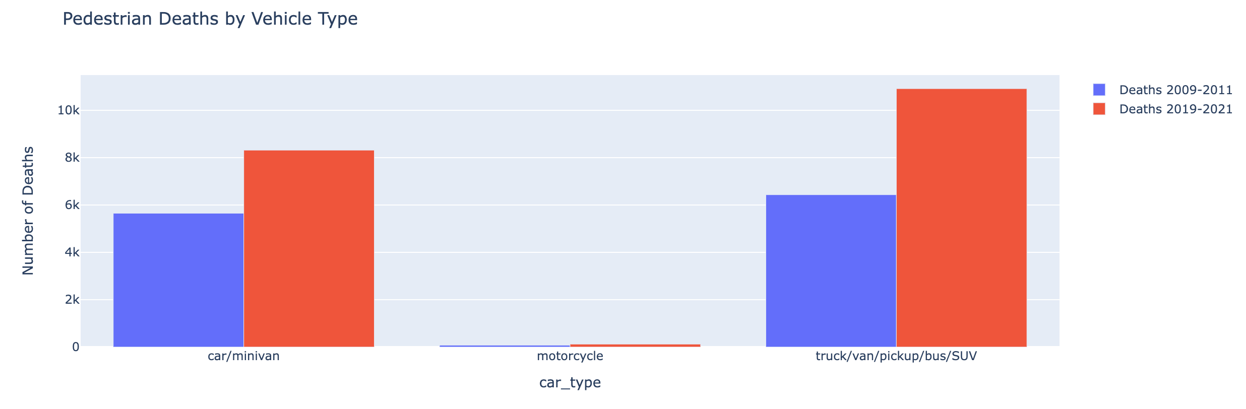
Between 2019 and 2021, nearly 11,000 pedestrians were killed by drivers of SUVs, vans, trucks, and pickups, while about 8,300 pedestrians were killed by drivers of cars and minivans.
That represents a 47% increase in the number pedestrians killed by people driving smaller vehicles, and a 70% increase in the number of pedestrians killed by people driving larger vehicles.
Astoundingly, SUVs with model years in the 2000s actually killed more people between 2019 and 2021 (when they were roughly 10-20 years old and many were off the road) than they did between 2009 and 2011 (when they were much newer).
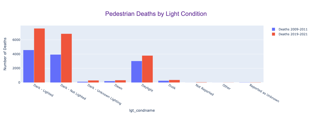
The Roads Are Especially Dangerous At Night
About 75% of pedestrian deaths happen at night, as the NY Times highlighted. This shows up perhaps most starkly in a comparison of deaths at different hours of the day based on light conditions from 2019-2021:
In the 6 AM hour (6 to 6:59 AM) — which in most parts of the US is light for about half the year — 758 pedestrians were killed when it was dark outside (mostly in the winter months), and only 119 were killed when it was light outside (mostly in the summer months).
In the 6 PM hour — also light for about half the year in the US — 1211 Americans were killed when it was dark, and only 226 were killed when it was light.
That discrepancy — more than 5x as many pedestrians dying at nighttime — is a strong signal that darkness is the largest driver of higher pedestrian mortality.
Even the wee hours of the morning have more pedestrian fatalities than every hour in the middle of the day.

(13 = 1 PM, 14 = 2 PM, … 20 = 8 PM, etc.)
The 2010s showed an increase in pedestrian fatalities for every single hour of the day, with larger increases at night. Daylight fatalities increased by 25%, while fatalities at night increased by 70%. Fatalities between 9 PM and midnight increased the most — by over 80%.
Young Drivers Kill More Pedestrians
Young drivers disproportionately kill pedestrians. From 2019-2021, more than 4000 pedestrians were killed by drivers aged 20-29 — 2.5x as many pedestrians as killed by drivers in their 60s. In about 20% of cases, the age of the driver is unknown.

However, there was little change in the relative numbers over the 2010s. Drivers in their 30s and 70s killed more pedestrians on a relative basis — but those increases largely reflect the relative sizes of their cohorts: there are more Baby Boomers and Millennials and fewer members of the Silent Generation and Generation X.
However, in the 2010s there was a pronounced shift in the ages of pedestrians killed: pedestrians aged 30-39 and 60-69 were much more at risk in 2020 than in 2010.

The number of 30-something and 60-something pedestrians killed by car drivers more than doubled.
By contrast, the rate of pedestrian fatalities for people under twenty actually went down.
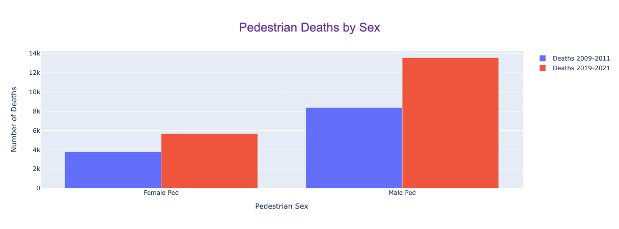
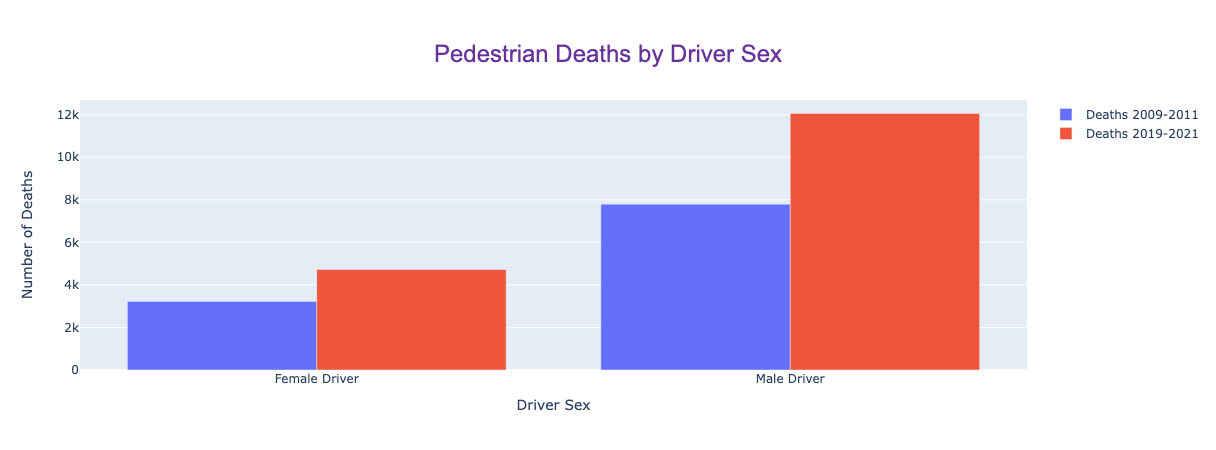
Riskier Male Drivers and Male Pedestrians At Risk
Male drivers kill pedestrians more than twice as often as female drivers, and male pedestrians are killed more than twice as often as female pedestrians.
Here are the numbers for pedestrian deaths; the increase in risk was greater for men than for women.
The rate of pedestrian fatalities caused by male drivers also increased more over the 2010s.
Poorer ZIP Codes Have More Pedestrian Deaths (and it’s getting worse)
From 2009-2011, the quintile of ZIP codes with the lowest incomes (per 2019 IRS data) accounted for 35% of pedestrian fatalities. Over the next 10 years, those ZIP codes saw an 80% increase in pedestrian fatalities, and they now account for 40% of the total.

The highest income ZIPs, by contrast, saw pedestrian fatalities increase by just 30%.
From 2019-2021, the lowest income quintile of ZIPs accounted for 40% of pedestrian deaths (up from 35%); the highest income quintile accounted for less than 10% of pedestrian deaths (down from almost 12%).
That means that the lowest income ZIP codes now have about four times as many pedestrian fatalities as the highest income ZIP codes2.
Red States Are Doing Worse on Pedestrian Fatalities (but red counties aren’t)
There has been a fair amount of media speculation that different statewide regulations are leading to different (worse) public health outcomes in red states. One inflammatory headline from the Washington Post reads “How Red State Politics Are Shaving Years Off American Lives.”
Though that headline may be clickbait, there may be some truth to the underlying claim. Here’s the size of the increase in pedestrian deaths by state and county from 2010-2020, looking at the combination of county (red, purple, or blue) and state (red, purple, or blue)3:
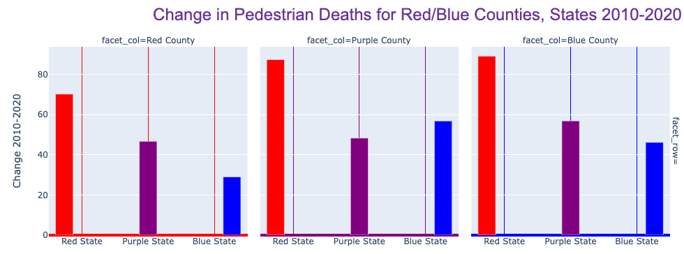
This graph represents increases from 2010 to 2020: the largest increases happened in blue counties in red states, followed by purple counties in red states, followed by red counties in red states. The smallest increases were in red counties in blue states.
In short, all of the largest increases were in red states, regardless of the political affiliation of the county. Counties in red states (red, purple, or blue) saw at least a 70% increase in pedestrian fatalities, while counties in blue and purple states saw increases of less than 60%.
Is that legislation-related? Government-related? Something else? Maybe…
Modeling Progress
It is tragic that so many more American pedestrians are being killed.
This alarming rise in pedestrian fatalities challenges our notion of progress: it shouldn’t be the case that a technology-driven process (driving cars) has gotten significantly less safe over a ten year period.
Quickly solving problems like these is an underrated tool in facilitating greater societal progress. While this analysis sheds light on some alarming trends, it only scratches the surface.
In the weeks to come, I’ll be digging deeper and exploring other techniques and data sources to try to get to the bottom of this.
A predictive model created with machine learning can provide a more robust answer to some of the questions in this post. I trained a model to distinguish between 2010 crashes and 2020 crashes; it highlighted types of pedestrian fatalities that were at least 4x as likely in 2020 as in 2010. Here’s a sample of a few crashes that the model said would be much more common in 2020:

These are disproportionately in Sun Belt and red states, in trucks/SUVs, and at night — all reflective of changes from 2010 to 2020.
In my next post, I’ll share more details on that model, how it applies to the problem of pedestrian fatalities, and I’ll discuss what we can learn from applying that approach to social science problems more broadly.
Analysis includes 2009, 2010, 2011, 2019, 2020, and 2021 FARS data from the NHTSA augmented with ZIP code level tax return data from the IRS, CDC data on drug overdoses and general health trends by county, MIT Election Data + Science Lab data on election results by county, and ACS five year data on education and demographics by county. The NHTSA data set is particularly extensive, with multiple tables that report on aspects of every fatal crash in the US: the make and model and year of all cars involved, the age and gender of everyone involved in each crash, details on the location and surroundings, and much more.
Numbers tied to ZIP codes represent the location of the crash, not the home ZIP code for either the driver or the pedestrian.
Red counties and states are defined as those with presidential two-party (R vs. D) vote share averaging at least 55% Republican in 2012, 2016, and 2020. Blue counties and states are those with two-party vote share at least 55% Democratic. Purple counties and states are those where neither party has a large advantage (i.e., closer than 55-45).
Very interesting - I don't hear anyone else talking about this subject. Should minivans be grouped with the larger trucks and vans rather than the sedans?
Did you look at intoxication as a factor? I think BAC was a column in one of your datasets. Intoxication plus distraction (from mobile devices) could make things even worse.
Also, could red, purple, and blue be a proxy for rural, suburban, urban? Could it be about increasing vehicle miles being driven out in rural areas turned exurbs?
Lastly, what if it’s less about roads becoming more dangerous, and more about pedestrians on the roads more? Could factors like homelessness, night shift work, etc cause more people to be out at night when they might have been home in prior years?